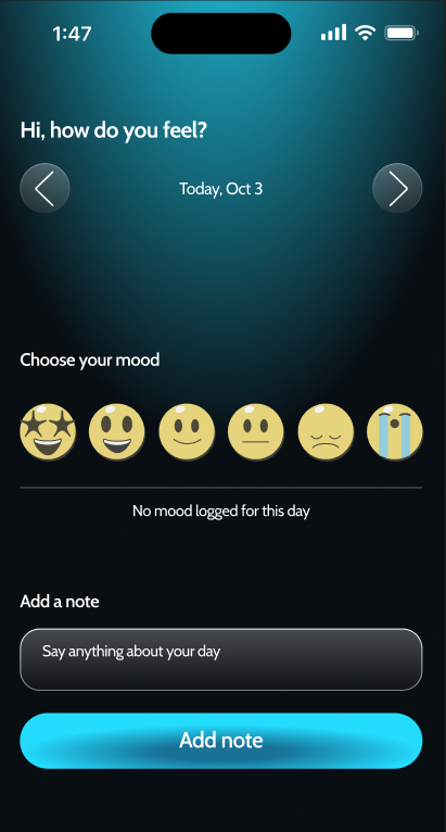
Mood tracker app concepts
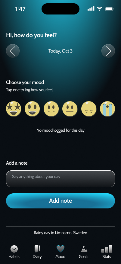
The mood tracker home page.
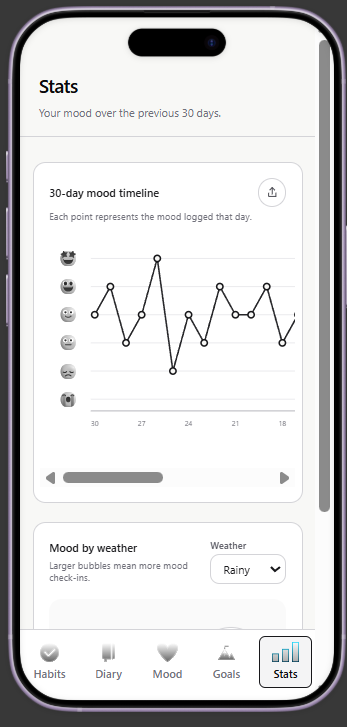
For this mood tracker app, I wanted to experiment further with incorporating AI into my workflow. I began with a mind map that captured all the app requirements I wanted to add. I had the idea to capture weather data while capturing mood to gauge how the weather affected a user’s mood.
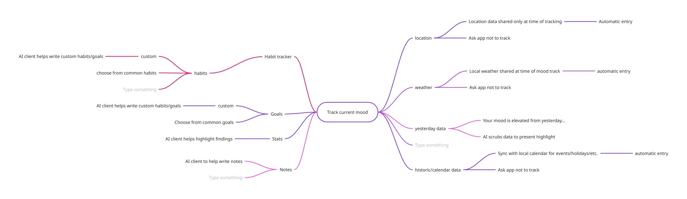
Requirements mind map
Using AI to wireframe swiftly
After recording the app requirements, I began to use Figma Make to generate quick wireframe concepts. I detailed everything I needed into the prompt including my own solutions and direction. Once I was happy with the wireframes I worked on the flow of the app, testing the generated prototype quickly to fix and solve usability issues as soon as I saw them.
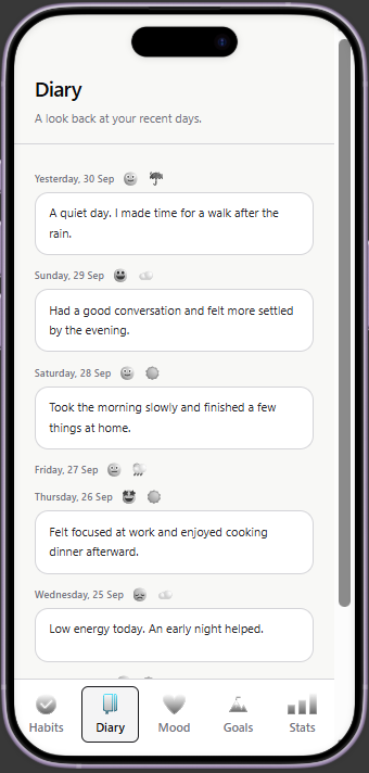
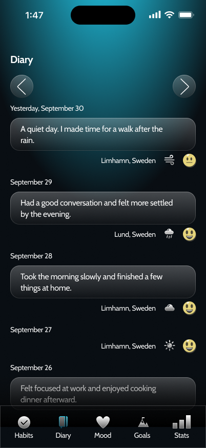
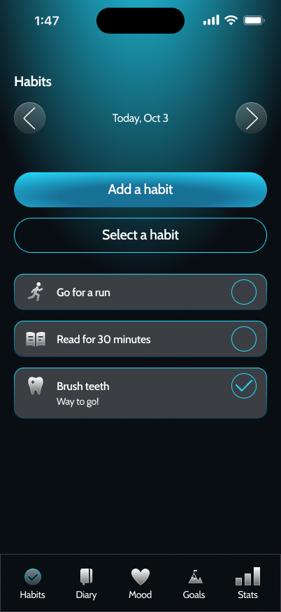
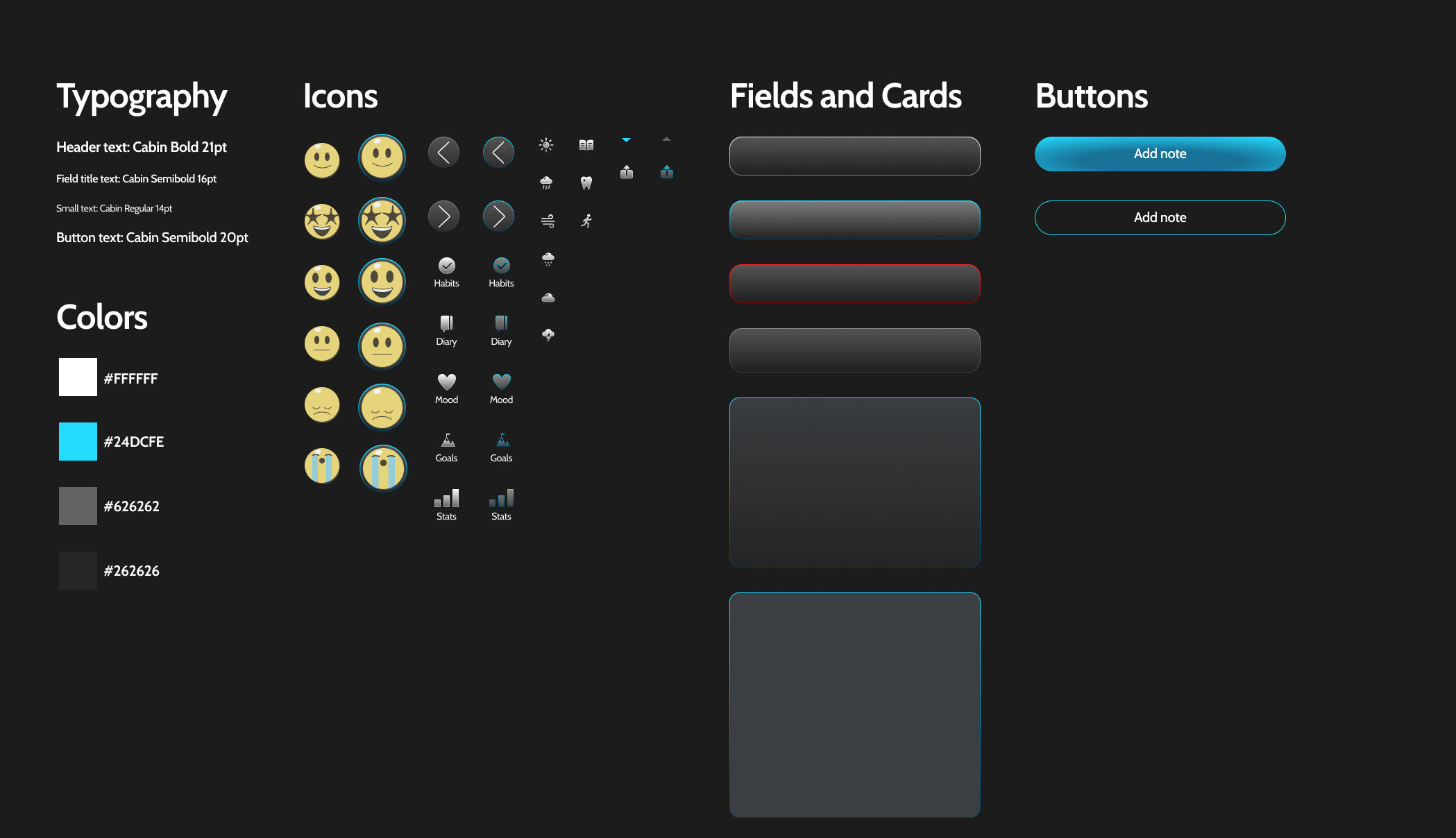
After wireframes I began to work on the UI of the app. I wanted something soft and relaxing, and I settled on a dark background with touches of bright cyan blue. Using the wireframes as a guide I filled out the UI of the various screens, paying special attention to accessibility as I did. I used Claude to generate some icon ideas and I picked a few to recreate in Figma.
One of the elements that wasn’t captured in the UI mockups but that made it to the Figma AI file was animated weather patterns. In the background of the Mood screen I wanted it to display an animated weather pattern. For instance, a rainy day would display soft rain falling in the background. This element helped to further solidify the weather/mood relationship I want to capture with this app.
The Stats Screen
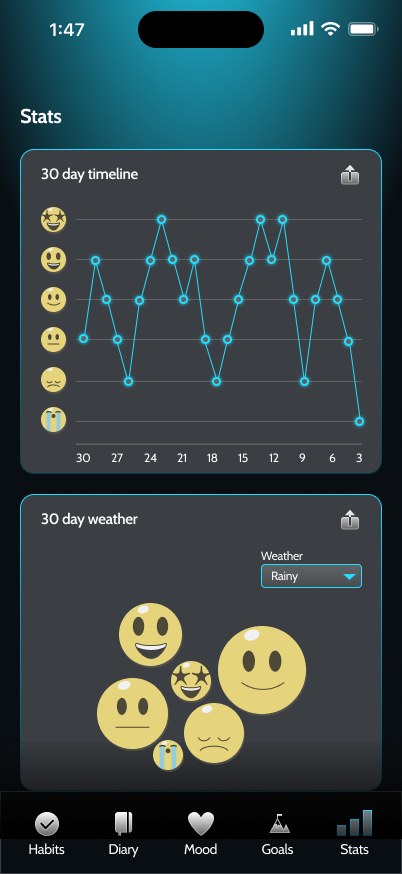
One of the challenges in this project was the Stats screen. I love to synthesize data and find interesting ways to display it to the user. With that being said, I wanted the stats screen to contain a few charts that could be relevant to the user. I settled on a mood timeline graph and a weather bubble chart. A mood timeline graph would plot points for each mood logged per day and display a 30 day limit. This would allow the user to see the ups and downs and understand a little more about their own mood stability. The weather bubble chart would plot the number of times each mood was logged per weather pattern over a 30 day timeline. This would allow the user to see quickly how the weather affected their moods. The bigger the bubble, the more times that mood was logged. I felt these detailed the soul of what I wanted to convey in the app while providing useable metrics for the user.
Components and Accessibility
From the first concept, I wanted this app to be accessible, as well as beautiful. Clear error states, high contrast and specific labels help the app pass WCAG guidelines. I tried to account for this in the components created for this app.
Conclusion
All in all, I’m very pleased with where these concepts landed. My next step is to use the prototype made in Figma Make to show to others and gather feedback from impromptu guerilla testing sessions. I find these sessions to be rich with information.